


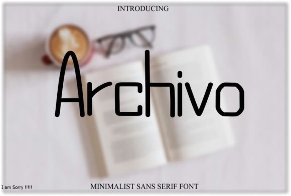
Archivo Font Download Premium Sans Serif Fonts: When it comes to typography, form should never come at the cost of function—especially in modern digital design. That’s where the Archivo Font family excels. Created with both visual clarity and performance in mind, Archivo is a sans-serif font that blends geometric structure with humanist readability, making it one of the best typefaces for user interfaces, editorial layouts, and responsive websites.
>>Archivo Font Download Premium Sans Serif Fonts<<
Whether you’re a web developer, graphic designer, or brand strategist, Archivo offers a versatile, high-performance font solution that works across platforms and devices. In this guide, we’ll explore everything you need to know about the Archivo font, including its features, use cases, download instructions, pairing suggestions, and more.
What is Archivo Font?
Archivo is a sans-serif font family developed by Omnibus-Type, a type foundry based in Argentina. Originally designed for high-performance typography, Archivo was created to meet the needs of digital platforms, print media, and user interfaces—all while maintaining a clear and consistent voice.
Key Features of Archivo Font:
-
Clean, modern sans-serif construction
-
High readability at all sizes
-
Optimized for both headlines and paragraphs
-
Comes in multiple weights (Regular, Medium, Bold, Italic)
-
Open-source and free to use
-
Excellent for UI/UX, editorial layouts, and branding
Its geometric design is balanced with a slightly mechanical feel, making it neutral but not bland, strong but not rigid—ideal for any project where clarity, structure, and modernity are essential.
Download Archivo Font Free from FontGeni
You can safely download the full Archivo Font family right here at FontGeni.com, available in both .TTF and .OTF formats. As an open-source font, Archivo is completely free to use for personal and commercial projects.
👉 [Click Here to Download Archivo Font Free]
Whether you need it for websites, apps, presentations, or printed materials, you’ll find Archivo to be one of the most reliable fonts in your toolkit.
How to Install Archivo Font
Installing Archivo Font is quick and easy:
🖥️ On Windows:
-
Download and unzip the font files from FontGeni.
-
Right-click the
.TTFor.OTFfiles. -
Click “Install” to add them to your system fonts.
-
Open your design or word processing software and select Archivo from the font list.
🍏 On macOS:
-
Double-click the font file.
-
Click “Install Font” in the Font Book app.
-
You’re ready to use Archivo in Photoshop, Figma, Word, and more.
🌐 On Canva & Web Tools:
Archivo is also available on Google Fonts, which means you can use it directly in Canva, Figma, Webflow, and most online tools without manual installation.
Where to Use Archivo Font
Archivo is a highly adaptable font that fits seamlessly into a wide range of design applications. Its strong legibility and wide character support make it especially suitable for:
💻 1. User Interface Design (UI/UX)
Archivo’s crisp, clean appearance ensures excellent readability on buttons, menus, forms, and dashboard interfaces. It scales well across mobile and desktop screens.
📰 2. Editorial & Magazine Layouts
Its professional and structured look works beautifully in digital or print layouts where multiple columns, headlines, and body text need to stay cohesive and clean.
🏢 3. Corporate Presentations
If you’re creating business presentations, reports, or pitch decks, Archivo’s modern formality gives your content a polished, trustworthy look.
🌐 4. Web Design & Development
Archivo is a favorite among developers using responsive design frameworks. Thanks to its availability on Google Fonts, it’s easily embedded into websites with excellent cross-browser compatibility.
🎓 5. E-learning, PDFs, and Documentation
Because of its clean structure, Archivo makes long-form reading easier. It’s perfect for educational content, workbooks, technical manuals, and downloadable PDFs.
Font Pairing Suggestions for Archivo
Archivo’s neutral and geometric nature makes it easy to pair with a wide range of typefaces. Here are some tried-and-tested combinations:
-
Archivo + Playfair Display
For a classic-modern mix—use Archivo for body text and Playfair Display for elegant headlines. -
Archivo + Lora
Perfect for blogs or editorial layouts—Lora’s serif detail contrasts beautifully with Archivo’s simplicity. -
Archivo + Roboto Mono
Great for tech and development content—Roboto Mono for code snippets, Archivo for headings and descriptions. -
Archivo + Archivo Narrow
Combine the two for a cohesive, modular layout with visual hierarchy. -
Archivo + Poppins
For a soft, rounded contrast—Poppins adds a playful tone while keeping it modern.
Archivo Font Family Variants
Archivo is part of a larger family that includes:
-
Archivo Regular
-
Archivo Italic
-
Archivo Medium
-
Archivo SemiBold
-
Archivo Bold
-
Archivo Black
-
Archivo Narrow – a condensed version perfect for space-saving design
This range gives you complete control over font weight, spacing, and emphasis—ideal for creating dynamic typographic hierarchies.
Similar Fonts to Archivo
Looking for fonts with a similar balance of performance and clarity? Here are some great alternatives to Archivo:
-
Inter – A modern web font optimized for UI and screen reading
-
Work Sans – Clean and minimal with excellent body text clarity
-
Nunito Sans – A slightly rounded sans serif with a friendlier tone
-
Helvetica Neue – A classic, but proprietary
-
Open Sans – Widely used in web design for its legibility and balance
Each of these fonts shares Archivo’s commitment to modernity and function.
FAQs – Archivo Font
Q1: Is Archivo Font free for commercial use?
A: Yes! Archivo is released under the SIL Open Font License, making it 100% free for both personal and commercial projects.
Q2: Can I use Archivo for my website?
A: Absolutely. Archivo is available on Google Fonts, so you can embed it in your HTML or CSS via a simple link. It also performs very well on responsive and mobile layouts.
Q3: Is Archivo good for body text?
A: Yes. Archivo was specifically designed for high readability at both large and small sizes, making it excellent for long-form content like blog posts, reports, and documentation.
Q4: What makes Archivo different from other sans-serif fonts?
A: Archivo combines geometric clarity with mechanical precision, making it more structured than many humanist sans-serifs but more readable than purely geometric fonts like Futura.
Q5: Is Archivo available in bold and italic styles?
A: Yes. Archivo comes in multiple weights and styles including Regular, Italic, Medium, Bold, and Black. This gives you a complete font system for professional layouts.
Final Thoughts: Archivo is Functional Typography Done Right
If you’re searching for a font that’s modern, clean, open-source, and endlessly versatile, look no further than the Archivo Font family. It’s the kind of typeface that works quietly in the background—making your content the star without drawing unnecessary attention to itself.
👉 Anton Font Download Premium Font from FontGeni.com and experience the clarity and power of modern typography in your next digital or print project.