
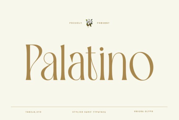


Some fonts simply fill space on a page; others bring character, story, and quiet sophistication. Palatino is firmly in the latter group—a timeless serif typeface rooted in tradition yet strikingly versatile. Its soft curves and classic proportions give it an elegance that’s subtle rather than showy, making it beloved by designers, publishers, and typographers around the world.
In this article, we explore how Palatino was thoughtfully crafted, what makes it special, and why it remains a go-to choice for projects that need a touch of classic beauty. Plus, we’ll share creative ideas for using it, where to download it (and free alternatives), and wrap up with helpful FAQs.
The Craftsmanship Behind Palatino
Palatino wasn’t just designed; it was drawn by hand, letter by letter. Born from a desire to create a serif font that balances elegance with simplicity, Palatino reflects the influence of Renaissance calligraphy—an era where letters were as much about beauty as communication.
Each character was carefully shaped, with special attention given to the smoothness of curves and the balance of each serif. The design is slightly condensed, which gives it an upright, refined appearance without feeling crowded. The creative process behind Palatino took countless hours of sketching, testing, and refining—work that shows in every stroke and line.
The result is a font that’s visually beautiful yet practical. Its classic proportions make it readable even at smaller sizes, while its graceful lines lend sophistication to headlines, books, and branding projects alike.
A Short History: From the Renaissance to the Digital Age
Palatino was designed by the legendary German type designer Hermann Zapf in 1948. Named after Giambattista Palatino, a 16th-century Italian master calligrapher, the font pays tribute to classic humanist letterforms.
Originally crafted for Linotype machines, Palatino quickly became popular thanks to its harmonious mix of traditional design and modern readability. Over time, it evolved into multiple digital versions—such as Palatino Linotype and Palatino Nova—which added new weights, extended character sets, and better support for digital typesetting.
While rooted in history, Palatino remains relevant in the modern design world. It bridges old and new, making it equally suitable for vintage-inspired projects and contemporary layouts.
Why Designers Love Palatino
✨ Elegant Simplicity
Palatino manages to be decorative yet restrained. Its delicate serifs and gentle curves add sophistication without overwhelming the reader.
📖 Exceptional Legibility
With open counters, generous letter spacing, and a large x-height, Palatino is highly readable—even in body text or on screens.
🎨 Versatility
Palatino works beautifully for books, invitations, websites, logos, and branding. It feels equally at home in formal documents and creative projects.
🖋 Calligraphic Touch
Zapf’s background in calligraphy shines through in Palatino’s graceful italic, adding a human warmth that purely geometric fonts lack.
🗂 Rich Family
Modern versions often include bold, italic, small caps, and old-style numerals, providing plenty of design flexibility.
Where to Download Palatino Font
Palatino is a commercial font, which means it’s typically not available for free download unless it’s bundled with licensed software.
✅ Adobe Fonts – available to Creative Cloud subscribers
✅ MyFonts – purchase individual weights or the entire family
✅ Fontspring & Linotype – trusted sources for official versions
If you use Microsoft Office, you may already have Palatino Linotype installed on your computer. It’s widely used in Word, PowerPoint, and other applications.
⚠ Tip: Avoid unofficial or pirated downloads. They often lack the correct glyphs, may have poor kerning, and could lead to legal trouble.
Free Alternatives to Palatino
If you’re looking for a similar feel without the commercial license, try these free alternatives:
-
Crimson Text – Warm and classic, perfect for books and elegant designs.
-
EB Garamond – Beautifully balanced, with historical charm.
-
Cardo – Academic style serif with calligraphic roots.
-
Cormorant Garamond – Modern, refined, and great for headings.
These are available on Google Fonts or open-source repositories and generally free for both personal and commercial use (always check the license).
Best Uses of Palatino Font
Palatino shines in projects where classic style and readability matter:
📚 Editorial Design – Books, academic papers, and poetry benefit from Palatino’s timeless look.
💌 Invitations & Cards – Weddings, formal events, or thank-you notes gain elegance with Palatino’s italic.
🏛 Certificates & Diplomas – Its classic serif design conveys authority and tradition.
🖥 Web Design – Used thoughtfully in headings or quotes, it brings sophistication to blogs and websites.
✏️ Branding – Ideal for brands wanting a refined, literary, or artistic identity.
📰 Posters & Print Ads – When used at large sizes, its curves and serifs become striking design elements.
Tips for Designing with Palatino
✅ Pair it carefully: Combine Palatino with a clean sans-serif like Helvetica, Montserrat, or Lato for contrast.
✅ Use italics intentionally: Palatino Italic has a hand-drawn, calligraphic feel perfect for emphasis.
✅ Adjust tracking in headings: Slightly tighter letter spacing can make headlines feel more cohesive.
✅ Maintain balance: Let Palatino’s classic style shine by avoiding overly ornate or trendy companion fonts.
FAQs About Palatino Font
Q1: Is Palatino Font free?
No, it’s a commercial font. Some versions, like Palatino Linotype, are bundled with Microsoft Office, but otherwise you need to buy a license.
Q2: Who created Palatino?
It was designed by Hermann Zapf in 1948, inspired by the work of Renaissance calligrapher Giambattista Palatino.
Q3: Can I use Palatino for commercial work?
Yes, if you have a licensed copy. Always check the licensing terms, especially for commercial products or branding.
Q4: Is Palatino good for long text?
Absolutely! Its open shapes and balanced design make it highly legible, even in books and reports.
Q5: What makes Palatino unique?
It combines the humanist, calligraphic influence of the Renaissance with modern clarity, creating a font that feels both classic and fresh.
Final Thoughts: Where Beauty Meets Simplicity
At its heart, Palatino is more than a typeface—it’s a tribute to the art of letter-making. From the careful hand-drawn beginnings to its graceful curves and elegant proportions, it embodies a design philosophy rooted in beauty, clarity, and timeless appeal.
Whether you’re typesetting a novel, designing a brand logo, or creating a heartfelt invitation, Palatino brings an understated elegance that never feels forced. It’s proof that sometimes the most powerful designs come not from bold statements but from thoughtful, quiet craftsmanship.
Ready to add classic beauty to your work? Discover Palatino and see how every curve and serif can bring sophistication to your next project.