


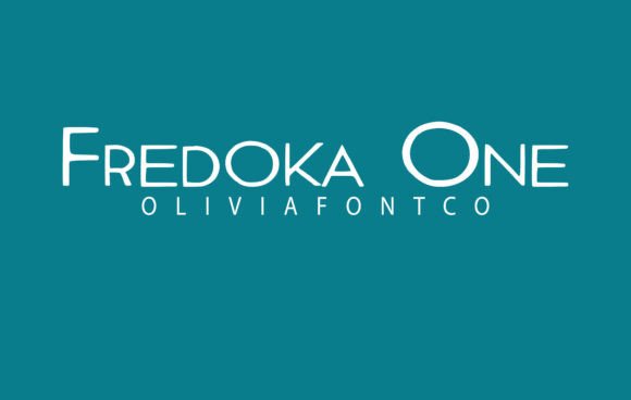
Fredoka One Font Download premium Font : If you’re searching for a font that combines bold style, modern simplicity, and a friendly personality, the Fredoka One Font checks every box. With its rounded letterforms and thick strokes, it gives off a sense of confidence without losing its soft charm. Whether you’re designing for a playful brand, a tech startup, or digital content that needs impact, Fredoka One delivers a visual punch that’s as welcoming as it is modern.
>>Fredoka One Font Download premium Font <<
In this guide, we’ll explore what makes Fredoka One such a popular choice among designers, where to download it safely, its ideal use cases, and how you can pair it with other fonts to create beautiful compositions.
What is Fredoka One Font?
Fredoka One is a rounded sans-serif display font created by Milena Brandau. Originally released through Google Fonts, this typeface has become a go-to choice for creatives looking for a font that’s bold yet soft, assertive yet approachable.
Its high weight and perfectly rounded corners make it perfect for headlines, logos, banners, and interface designs where clarity and character are both priorities. The simplicity of its form makes it highly legible, while its boldness gives it the strength to stand out in any design.
Key Features of Fredoka One Font
Here’s why Fredoka One stands out in the sea of rounded fonts:
✔️ Bold & Approachable
Its thick strokes give it presence, while its soft edges keep the tone friendly and non-aggressive — perfect for consumer-facing brands.
📱 Screen-Friendly Design
Fredoka One performs beautifully on mobile and web platforms. It’s highly legible at larger sizes, making it perfect for banners, buttons, and hero headings.
🎯 Attention-Grabbing
With just the right amount of roundness and weight, Fredoka One is designed to attract eyes while remaining clean and easy to read.
🆓 100% Free for Commercial Use
Licensed under the Open Font License (OFL), Fredoka One is completely free for personal and commercial projects.
Where to Use Fredoka One Font
Fredoka One is a display font, meaning it’s designed for use in larger sizes — titles, logos, signage, etc. Here are some of the best ways to use it:
🔹 Branding & Logos
Fredoka One is excellent for tech startups, DTC brands, apps, and companies that want to appear fun, modern, and trustworthy.
🔹 Web Banners & Hero Text
Its bold weight and soft shape make it a star choice for eye-catching headers and landing page banners.
🔹 App Interfaces
Because of its readability and cheerful style, Fredoka One is often used in UI/UX design, especially for apps targeting a younger audience.
🔹 Children’s Content
Whether it’s a toy label, kids’ book, or educational game, this font screams “fun” without being too decorative.
🔹 Posters & Flyers
Perfect for digital posters, event flyers, and announcements that need to grab attention instantly.
Fredoka One Font Download
You can safely and easily download Fredoka One in multiple formats:
✅ FontGeni.com
We provide a direct .ttf download link for Fredoka One — safe, fast, and free.
✅ Google Fonts
Available for web and desktop use. You can either:
-
Click “Download Family”
-
Or use the embed code to load it via
<link>in HTML
📥 How to Install:
For Windows:
-
Download the
.ttffile -
Right-click → “Install”
-
Open design software — font will be available
For macOS:
-
Double-click the
.ttffile -
Click “Install Font”
-
It’ll show in Font Book and your applications
Font Pairing Ideas: What Goes Well with Fredoka One?
Because Fredoka One is a heavy display font, it pairs best with clean, neutral body fonts. Here are some ideal combinations:
| Font Pair | Why It Works |
|---|---|
| Open Sans | Clean, readable body font |
| Lato | Modern sans-serif with great contrast |
| Roboto | Balanced structure for digital use |
| Montserrat Light | Sleek and geometric, balances the weight |
| Merriweather | Adds a classic serif contrast |
Similar Fonts to Fredoka One
If you’re exploring similar styles or want alternatives, check out:
-
Baloo 2 – Rounded and friendly with an Indian vibe
-
Quicksand – Lighter and more geometric
-
Rubik – More formal but still rounded
-
Nunito – Slightly less playful but very readable
-
Poppins – Geometric sans-serif with a modern edge
Pros & Cons of Using Fredoka One
✅ Pros:
-
Bold and friendly
-
Perfect for display use
-
Free for commercial projects
-
Web and mobile compatible
-
Easy to pair with body fonts
⚠️ Cons:
-
Not suitable for small text or paragraphs
-
Only one style/weight available (no italic, light, etc.)
-
Can feel overly playful for serious or formal designs
FAQs – Fredoka One Font
Q1. Is Fredoka One free for commercial use?
Yes! It is licensed under the Open Font License (OFL) and is completely free for personal and commercial use.
Q2. Can I use Fredoka One in a logo?
Absolutely. Its bold nature makes it great for logos, especially for tech, kids’ brands, or fun retail companies.
Q3. Does Fredoka One come in multiple weights?
No. Fredoka One only includes a single regular weight. For more variation, you can try Fredoka (variable) on Google Fonts.
Q4. Is Fredoka One suitable for body text?
Not really. It’s designed for headings and larger sizes. For long-form text, pair it with a lighter sans-serif or serif font.
Final Thoughts
Fredoka One Font is proof that bold doesn’t have to mean aggressive. With its soft edges, simple geometry, and approachable personality, it’s a top choice for modern branding, app interfaces, headlines, and anything that needs to stand out with a smile.
Whether you’re working on a new startup logo, a social media campaign, or an app UI, Fredoka One adds just the right balance of fun and function.
🎉 Ready to add it to your toolkit?
👉 Download Fredoka One from FontGeni.com and start creating designs that speak loud — and kind.