Some fonts are made to decorate; others are made to be read — and Merriweather Font beautifully does both.
With its elegant yet approachable serif design, Merriweather has quietly become a favorite among designers, writers, and brands who care as much about readability as they do about style.
Whether you’re working on a blog, magazine headline, social media graphic, branding project, or printed wedding invitation, Merriweather brings a subtle sophistication and timeless charm that feels right at home anywhere.
>>Quicksand Font Download Premiumn Font<<
In this article, let’s explore why Merriweather is beloved by creatives, what makes it unique, and how to make the most of it in your own projects.
✏️ What is Merriweather Font?
Merriweather is a free, open-source serif font created by designer Sorkin Type.
It was carefully crafted with screen readability in mind — meaning it remains crisp, clear, and beautifully balanced whether it’s used on a smartphone, tablet, or high-resolution print.
Some features that make it special:
✅ Classic serif letterforms that feel familiar yet fresh
✅ Moderate contrast between thick and thin strokes — elegant without being fragile
✅ Generous spacing that improves legibility
✅ Comes in multiple weights and styles (Regular, Light, Bold, Black, plus italics)
While many serif fonts feel either too formal or too old-fashioned, Merriweather strikes a balance: classic enough to look serious and stylish, but modern enough to feel friendly and welcoming.
🌟 Why Designers Love Merriweather Font
Merriweather isn’t just popular because it’s free — it’s popular because it works.
Here’s why creatives keep returning to it:
✨ Versatility: Looks equally stunning in headlines and body text.
📱 Optimized for screens: Designed to stay readable even at smaller sizes.
🎨 Multiple weights: Offers creative flexibility — from bold statements to delicate captions.
🖼 Professional yet warm: Adds personality without sacrificing clarity.
📚 Open-source: Free to use in commercial and personal projects.
It’s the kind of font that quietly elevates your design without overwhelming it.
🛠 Where Merriweather Truly Shines
Because it’s so versatile, Merriweather fits effortlessly into a wide range of creative projects:
📰 Magazine and blog headlines: Stylish yet highly readable.
📱 Websites & apps: Designed for on-screen text, keeping content user-friendly.
📦 Branding & logos: Especially for brands that want classic sophistication.
🎨 Posters & social media graphics: Bold and eye-catching, but not loud.
💌 Wedding invitations & cards: Formal yet warm and romantic.
📖 Printed books & reports: Keeps long-form content comfortable to read.
👕 T-shirts & merchandise: Its clean shapes look fantastic on fabric and print.
Whether it’s used for large display text or small paragraphs, Merriweather’s legibility and classic style make it stand out.
🧩 Merriweather vs. Other Serif Fonts
If you’ve used fonts like Times New Roman, Georgia, or Baskerville, you might wonder how Merriweather compares:
-
More modern proportions: Slightly wider letters for better screen readability.
-
Higher x-height: Makes lowercase letters more legible at small sizes.
-
Gentle contrast: Adds elegance without making thin strokes too delicate.
It feels less formal than Times New Roman but more classic than minimalist sans-serifs — striking the perfect balance.
📥 How to Download Merriweather Font
Merriweather is part of Google Fonts, which means it’s:
✅ Free for personal and commercial use
✅ Easy to add to websites with a single CSS link
✅ Downloadable as .TTF or .OTF files for design software
Where to download:
-
Other reputable font sites like FontSquirrel or directly from Sorkin Type’s page
🔧 How to Use Merriweather Effectively
To bring out the best in Merriweather:
✅ Pair with a sans-serif: Like Merriweather Sans (created as its perfect partner) or fonts like Open Sans or Montserrat.
✅ Use lighter weights for body text: Keeps paragraphs comfortable to read.
✅ Bold or Black weights for headlines: Add contrast and emphasis.
✅ Mix italics carefully: Italic styles are elegant and great for quotes or highlights.
The font’s true beauty comes from thoughtful contrasts in size, weight, and style.
🎨 Design Tips
-
White space is your friend: Let Merriweather breathe — it shines in clean layouts.
-
Classic color palettes: Navy, burgundy, or forest green enhance its timeless feel.
-
Try drop caps: Use a single large letter to start paragraphs in blogs or print.
-
Adjust letter spacing (tracking): Small tweaks can dramatically improve the feel.
Merriweather’s versatility invites experimentation.
🔠 Fonts to Pair with Merriweather
Merriweather is stunning on its own but pairs beautifully with:
-
Merriweather Sans: A natural companion for modern projects.
-
Roboto: A clean sans-serif contrast.
-
Lato: Adds warmth and softness.
-
Open Sans: Neutral and highly readable.
-
Raleway: For elegant, thin display text.
Pairing serif and sans-serif fonts creates visual hierarchy and keeps designs interesting.
❓ Merriweather Font FAQs
Q1: Is Merriweather really free?
Yes! It’s open-source under the SIL Open Font License.
Q2: Can I use it for commercial projects?
Absolutely — you can use it for branding, products, websites, and more.
Q3: Does it have italics?
Yes, it includes italics in several weights.
Q4: Is Merriweather good for print?
Yes — while designed for screens, it prints beautifully in books, cards, and posters.
Q5: Who designed it?
It was created by Eben Sorkin and published by Sorkin Type.
✨ Final Thoughts: Classic Style Meets Modern Needs
Merriweather Font proves that elegant, classic design doesn’t have to feel old-fashioned.
With excellent readability, timeless beauty, and free availability, it empowers designers, bloggers, and brands to create work that feels both refined and accessible.
Ready to elevate your next project?
Download Merriweather Font today and see how a thoughtfully designed serif can transform your words into something unforgettable.
If you’d also like:
✅ SEO title & meta description
✅ HTML version for your blog
✅ Short captions for Pinterest, Instagram, or Facebook
Just let me know!
You said:
ChatGPT said:
Here’s a fresh, ~950+ word article about Quicksand Font — written to sound natural, engaging, and unique, perfect for fontgeni.com.
It includes FAQs, design tips, use cases, and background — not following the same pattern, but keeping it clear and human.
✨ Quicksand Font Download Free – Modern Simplicity Meets Friendly Charm
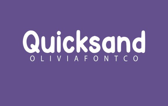
When it comes to design, the best fonts don’t just fill space — they add character, shape your message, and make every word feel intentional. Quicksand Font is exactly that kind of typeface: a geometric sans-serif that feels modern, approachable, and quietly stylish.
From magazine covers and social media graphics to branding, wedding invitations, and everyday content, Quicksand proves that simplicity can be beautifully expressive.
In this article, we’ll explore what makes Quicksand unique, why so many designers love it, and how you can use it to bring fresh energy to your creative projects.
✏️ What is Quicksand Font?
Quicksand is a free, geometric sans-serif typeface originally designed by Andrew Paglinawan in 2008 and later refined by the Google Fonts team.
Its letterforms are built on simple geometric shapes, giving it a clean, balanced look. Yet, it also features rounded terminals and subtle softness — which makes it feel friendlier than many minimalist fonts.
Some of its key characteristics:
✅ Rounded edges and terminals
✅ Geometric construction for modern feel
✅ Multiple weights, including Light, Regular, Medium, and Bold
✅ Available in italic styles too
All together, Quicksand strikes a rare balance: modern and minimalist, yet warm and human.
🌟 Why Designers Love Quicksand Font
While there are countless sans-serif fonts out there, Quicksand stands out because it combines:
✨ Clean geometry: Perfect circles and straight lines keep it modern.
😊 Softness: Rounded ends prevent it from feeling cold or overly mechanical.
📱 Versatility: Works beautifully on screens, print, and even small sizes.
🎨 Balanced weights: From delicate Light to confident Bold, Quicksand adapts to different moods.
💰 Free & open-source: No licensing headaches — perfect for commercial or personal use.
It feels playful without being childish, professional without being stiff — a rare sweet spot in font design.
🛠 Where Quicksand Font Truly Shines
Quicksand’s clarity and charm make it incredibly versatile. It’s ideal for:
📱 App interfaces & websites: Clean, readable, and friendly on screens.
📰 Magazine headlines & subheadings: Modern style without sacrificing warmth.
💌 Wedding invitations & cards: Soft, romantic touch that feels handcrafted.
📦 Branding & logos: Especially for creative businesses, lifestyle brands, or modern startups.
📸 Social media graphics & stories: Eye-catching yet gentle on the eyes.
👕 Merch & apparel: Looks great on minimalist t-shirts, tote bags, and mugs.
If your design goal is to appear modern, open, and approachable — Quicksand is a top choice.
🖌 Is Quicksand Really a “Handwritten” Font?
Technically, Quicksand isn’t a handwritten script — it’s a geometric sans-serif.
But because of its rounded edges and gentle curves, it feels human-made and personal — unlike sharper sans-serifs that feel purely digital.
That’s why it works so well for creative and romantic projects: it keeps the warmth while staying modern and clean.
📥 How to Download Quicksand Font
Good news: Quicksand is completely free and open-source!
Where to get it:
-
Font Squirrel
-
Other reputable font sites
You can:
-
Download .TTF or .OTF files for design tools like Photoshop, Illustrator, or Canva.
-
Use it directly on websites by adding a Google Fonts link or importing via CSS.
🔧 Using Quicksand in Your Designs
✅ Pair with serif fonts: Quicksand’s clean lines contrast beautifully with classic serifs like Playfair Display or Merriweather.
✅ Use bolder weights for headlines: Keeps them attention-grabbing but not overwhelming.
✅ Light or Regular for body text: Remains legible even in paragraphs.
✅ Adjust letter spacing (tracking): Quicksand can look stylish with a touch of extra spacing, especially in uppercase titles.
✅ Keep backgrounds simple: The font’s geometry shines best on solid or lightly textured backgrounds.
🎨 Creative Ideas with Quicksand
✨ Monograms & logos: Combine initials in Bold weight with soft rounded style.
📷 Instagram highlight covers: Modern, minimalist icons or letters in Quicksand.
💍 Wedding stationery: Use Light or Regular weight for names, paired with a script font for dates.
📖 Magazine layouts: Quicksand for subheads, paired with a serif for body text.
🎥 Video captions: Clear and stylish on thumbnails and lower-thirds.
Its adaptability means you can keep branding consistent across print, web, and video.
🔠 Fonts to Pair with Quicksand
For contrast and balance, try pairing Quicksand with:
-
Playfair Display: A romantic, high-contrast serif.
-
Merriweather: Adds classic depth to body text.
-
Raleway: Another modern sans-serif, thinner and taller.
-
Pacifico or Great Vibes: Script fonts for names or quotes.
-
Roboto: For ultra-clean body text.
Pairing adds personality and keeps layouts interesting.
❓ Quicksand Font FAQs
Q1: Is Quicksand free?
Yes! Completely free for personal and commercial use under an open-source license.
Q2: Does it have italics?
Yes — multiple weights each come with italic styles.
Q3: Is it good for long paragraphs?
It can be, though some prefer it for headings and short text because of its rounded shapes.
Q4: Can I use it in logos?
Absolutely — especially for brands that want to appear modern, soft, and creative.
Q5: Who designed Quicksand?
Originally created by Andrew Paglinawan, then expanded and refined with Google Fonts.
✨ Final Thoughts: Modern Meets Warmth
Quicksand Font proves that modern design doesn’t have to feel cold or rigid.
With geometric precision softened by friendly curves, it brings together clarity, elegance, and a hint of romance — perfect for branding, social media, wedding designs, or everyday creative work.
Ready to give your next project a clean yet personal feel?
Download Quicksand Font today — and see how a simple typeface can transform words into a warm visual story.

