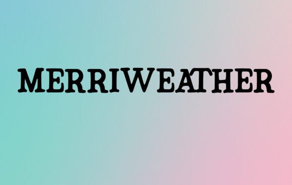
Some fonts are made to decorate; others are made to be read — and Merriweather Font beautifully does both.
With its elegant yet approachable serif design, Merriweather has quietly become a favorite among designers, writers, and brands who care as much about readability as they do about style.
Whether you’re working on a blog, magazine headline, social media graphic, branding project, or printed wedding invitation, Merriweather brings a subtle sophistication and timeless charm that feels right at home anywhere.
>>Meriweather Font Download Premium Font<<
In this article, let’s explore why Merriweather is beloved by creatives, what makes it unique, and how to make the most of it in your own projects.
✏️ What is Merriweather Font?
Merriweather is a free, open-source serif font created by designer Sorkin Type.
It was carefully crafted with screen readability in mind — meaning it remains crisp, clear, and beautifully balanced whether it’s used on a smartphone, tablet, or high-resolution print.
Some features that make it special:
✅ Classic serif letterforms that feel familiar yet fresh
✅ Moderate contrast between thick and thin strokes — elegant without being fragile
✅ Generous spacing that improves legibility
✅ Comes in multiple weights and styles (Regular, Light, Bold, Black, plus italics)
While many serif fonts feel either too formal or too old-fashioned, Merriweather strikes a balance: classic enough to look serious and stylish, but modern enough to feel friendly and welcoming.
🌟 Why Designers Love Merriweather Font
Merriweather isn’t just popular because it’s free — it’s popular because it works.
Here’s why creatives keep returning to it:
✨ Versatility: Looks equally stunning in headlines and body text.
📱 Optimized for screens: Designed to stay readable even at smaller sizes.
🎨 Multiple weights: Offers creative flexibility — from bold statements to delicate captions.
🖼 Professional yet warm: Adds personality without sacrificing clarity.
📚 Open-source: Free to use in commercial and personal projects.
It’s the kind of font that quietly elevates your design without overwhelming it.
🛠 Where Merriweather Truly Shines
Because it’s so versatile, Merriweather fits effortlessly into a wide range of creative projects:
📰 Magazine and blog headlines: Stylish yet highly readable.
📱 Websites & apps: Designed for on-screen text, keeping content user-friendly.
📦 Branding & logos: Especially for brands that want classic sophistication.
🎨 Posters & social media graphics: Bold and eye-catching, but not loud.
💌 Wedding invitations & cards: Formal yet warm and romantic.
📖 Printed books & reports: Keeps long-form content comfortable to read.
👕 T-shirts & merchandise: Its clean shapes look fantastic on fabric and print.
Whether it’s used for large display text or small paragraphs, Merriweather’s legibility and classic style make it stand out.
🧩 Merriweather vs. Other Serif Fonts
If you’ve used fonts like Times New Roman, Georgia, or Baskerville, you might wonder how Merriweather compares:
-
More modern proportions: Slightly wider letters for better screen readability.
-
Higher x-height: Makes lowercase letters more legible at small sizes.
-
Gentle contrast: Adds elegance without making thin strokes too delicate.
It feels less formal than Times New Roman but more classic than minimalist sans-serifs — striking the perfect balance.
📥 How to Download Merriweather Font
Merriweather is part of Google Fonts, which means it’s:
✅ Free for personal and commercial use
✅ Easy to add to websites with a single CSS link
✅ Downloadable as .TTF or .OTF files for design software
Where to download:
-
Other reputable font sites like FontSquirrel or directly from Sorkin Type’s page
🔧 How to Use Merriweather Effectively
To bring out the best in Merriweather:
✅ Pair with a sans-serif: Like Merriweather Sans (created as its perfect partner) or fonts like Open Sans or Montserrat.
✅ Use lighter weights for body text: Keeps paragraphs comfortable to read.
✅ Bold or Black weights for headlines: Add contrast and emphasis.
✅ Mix italics carefully: Italic styles are elegant and great for quotes or highlights.
The font’s true beauty comes from thoughtful contrasts in size, weight, and style.
🎨 Design Tips
-
White space is your friend: Let Merriweather breathe — it shines in clean layouts.
-
Classic color palettes: Navy, burgundy, or forest green enhance its timeless feel.
-
Try drop caps: Use a single large letter to start paragraphs in blogs or print.
-
Adjust letter spacing (tracking): Small tweaks can dramatically improve the feel.
Merriweather’s versatility invites experimentation.
🔠 Fonts to Pair with Merriweather
Merriweather is stunning on its own but pairs beautifully with:
-
Merriweather Sans: A natural companion for modern projects.
-
Roboto: A clean sans-serif contrast.
-
Lato: Adds warmth and softness.
-
Open Sans: Neutral and highly readable.
-
Raleway: For elegant, thin display text.
Pairing serif and sans-serif fonts creates visual hierarchy and keeps designs interesting.
❓ Merriweather Font FAQs
Q1: Is Merriweather really free?
Yes! It’s open-source under the SIL Open Font License.
Q2: Can I use it for commercial projects?
Absolutely — you can use it for branding, products, websites, and more.
Q3: Does it have italics?
Yes, it includes italics in several weights.
Q4: Is Merriweather good for print?
Yes — while designed for screens, it prints beautifully in books, cards, and posters.
Q5: Who designed it?
It was created by Eben Sorkin and published by Sorkin Type.
✨ Final Thoughts: Classic Style Meets Modern Needs
Merriweather Font proves that elegant, classic design doesn’t have to feel old-fashioned.
With excellent readability, timeless beauty, and free availability, it empowers designers, bloggers, and brands to create work that feels both refined and accessible.
Ready to elevate your next project?
Download Merriweather Font today and see how a thoughtfully designed serif can transform your words into something unforgettable

